Chapter 3-16: Using GUI Features of the Image Editor |
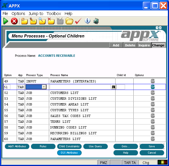
Defining Graphical Attributes for Optional Children Because Optional Children can appear in one or more places (pulldown menu, right-click context menu, etc.), graphical attributes can be defined to control how and where available optional child processes are listed on menu or input images. The GUI Attributes overlay for Optional Child Processes is accessed from the Optional Children overlay shown below. Graphical Attributes must be defined individually for each Optional Child process you define. They cannot be defined globally for all optional processes defined for a process.
Optional Children Overlay for a Menu Process When selecting the GUI attributes option from either a menu process or input process image, the Graphical Attributes overlay appears.
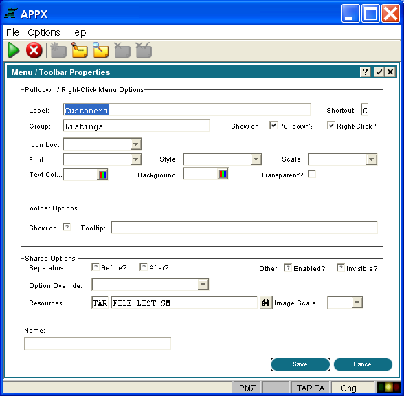
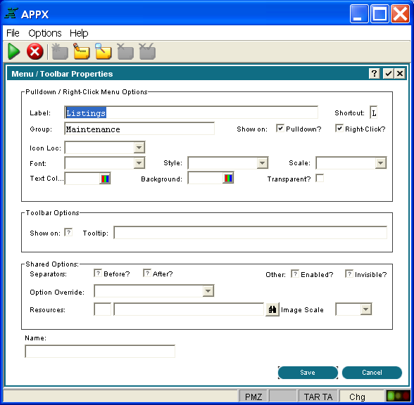
Optional Child Graphical Attributes Overlay The Optional Child Graphical Attributes overlay contains the following items: Pulldown/Right-Click Menu Options Label is the descriptive text which appears on the menu or input image. If left blank, the descriptive name of the process invoked is used. Shortcut is a single key on the keyboard that when pressed in conjunction with the Alt key, invokes this optional child process. The first occurrence of this key in the Label text will be underlined to tell the user what the shortcut key is. For example, if the Label is Customers and the Shortcut is C, then the Label will display as Customers. Group refers to either the top-level name which appears on the pull-down menu or the Label of a previously defined child so that a cascading menu can be defined.
Show on Pull Down Menu? indicates if this optional child process should be displayed as a pull down menu. Click the checkbox to toggle between 'yes'
Show on Right-Click Menu? indicates if this optional child process should be displayed as a right-click, context menu. Click the checkbox to toggle between 'yes'
Icon Location indicates where the icon should be placed in relation to the Label. Click the list
Font identifies the font ( Courier, Arial, etc.) to be used for the title. Click the list
Style identifies the font style (bold, italic, etc.) to be used for the title. Click the list
Scale indicates a percentage by which to scale the default size of this font (50%, 150%, etc.). Click the list Text Color indicates the color of the label text. You can enter a specific color name or click the Color selection icon to make the color selection. See the Making Color Selections section for more details. Background Color indicates the color of the label background. You can enter a specific color name or click the Color selection icon to make the color selection. See the Making Color Selections section for more details. Transparent? indicates whether or not the background should be opaque or transparent. Toolbar Options Show On indicates if this optional child will appear graphically on the tool bar. Note that if you define a graphical representation for this item (an icon, for example), then a resource with an enabled state icon must be specified in order for this child to appear on the tool bar. Tooltip is 60 characters of help text that you can enter. The tooltip is displayed to users as a "hover over" when the mouse pointer is passed over the respective icon. Shared Options
Separator Before? indicates if a separator line should be placed before this optional process label to better segregate labels into logical groups. Click the checkbox to toggle between 'yes'
Separator After? indicates if a separator line should be placed after this optional process label to segregate labels into logical groups. Click the checkbox to toggle between 'yes'
Enabled? Indicates if this icon or button should initially be enabled and available for use by the user. The icon or button can also be enabled or disabled through the use of ILF code that references the Name field. Click the checkbox to toggle between 'yes'
Invisible? indicates whether this icon or button should initially be invisible to the user. The icon or button can also be made visible or invisible through the use of ILF code that references the Name field. Click the checkbox to toggle between 'yes'
Option Override? allows the current option to be overridden at runtime with the option specified here. Click the list Resource specifies< the application and name of a resource defined in Named Resources which links to one or more graphics files. Different graphics can apply depending upon resource state (disabled, enabled, rollover, pressed, etc).
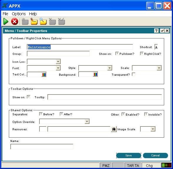
Image Scale defines the size of the graphic as a percentage of the runtime font size. Click the list Name is the name assigned to this GUI Attribute. The name is used for controlling the GUI object with ILF code so that, for example, certain selections could be disabled by user id. Access to the GUI attributes at runtime with ILF code is done via the --- WIDGET file. The WIDGET records from the process are copied into this file and are available in the Pre-Display event point. WIDGET NAME is a key to this file. You can read and rewrite records in this file to affect the GUI attributes at runtime for the current frame only. When you have finished defining the graphical attributes for this image, you must save or cancel the attributes by selecting either the Save or Cancel options located in the bottom right of the screen. Other examples of pulldown menu specifications are provided in the figures below:
Final Level of a Cascading Pull-Down Menu
First Level of a Cascading Pull-Down Menu |
Application Design Manual "Powered by Appx Software"458 ©2006 By APPX Software, Inc. All Rights Reserved |
 and 'no'
  .
. button to select from either LEADING or TRAILING.